Kruger Recruiting
A boutique recruiter's brand, rebuilt to feel as personal as she is.
Overview
Kruger Recruiting is a boutique recruiting practice run by Cheri Kruger. In fifteen years she has placed close to a thousand engineers, leaders, and operators across the United States, Canada, and LATAM. She had the track record. What she did not have was a website that looked like it belonged to her.
This was a design and build engagement. The detailed performance story lives on the Sparkable site. Here I want to talk about the design.
The brief
Cheri's old site used a generic forest green and read like every other recruiting page on the internet. Her actual brand is the opposite of generic. She is warm, direct, and personal, the kind of recruiter who texts you back and remembers your kids' names. So the brief was simple to say and hard to do: make it genuinely professional, but keep it unmistakably hers. Her one hard rule, in her own words, was no navy blue like every other enterprise website.
Choosing a color no one else owns
Most recruiters are blue or grey, so I ruled those out on purpose. Purple read too tech-startup. Burgundy felt like a luxury brand pretending. Navy was off the table by her own rule. I landed on a deep emerald green.
Green carries the right meaning for what Cheri does, which is helping companies grow and scale. The specific emerald I chose leans warm, it has a little yellow in it, so it feels alive rather than clinical. It is genuinely uncommon in recruiting, which makes it ownable, and it nods to the forest green she already had, evolving her identity forward instead of throwing it away.
The design system
The whole site runs on a light and dark rhythm. Pure white sections carry the reading. Near-black sections open and close the page, and on those dark surfaces the emerald glows. That contrast is the entire personality of the design.
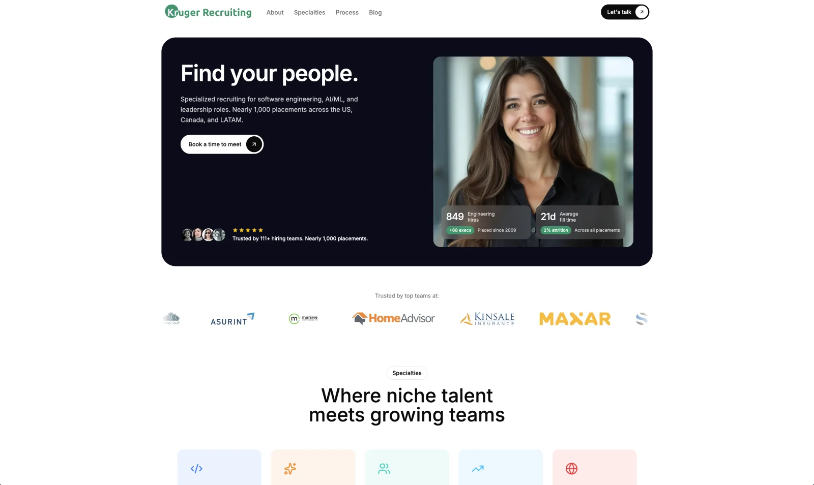
- A dark hero where "Find your people" sits against near-black, with Cheri's real placement numbers floating beside it on glass cards, like a quiet growth dashboard.
- Soft, generously rounded cards and pill buttons, so it feels premium and approachable rather than corporate.
- A specialties grid showing the niches she actually fills: software engineering, AI and ML, leadership and executive, sales and GTM.
- A warm, first-person voice throughout, because the real product here is Cheri herself.
- Small motion details: buttons that lift and glow on hover, sections that settle into place as you scroll.
Built to earn trust
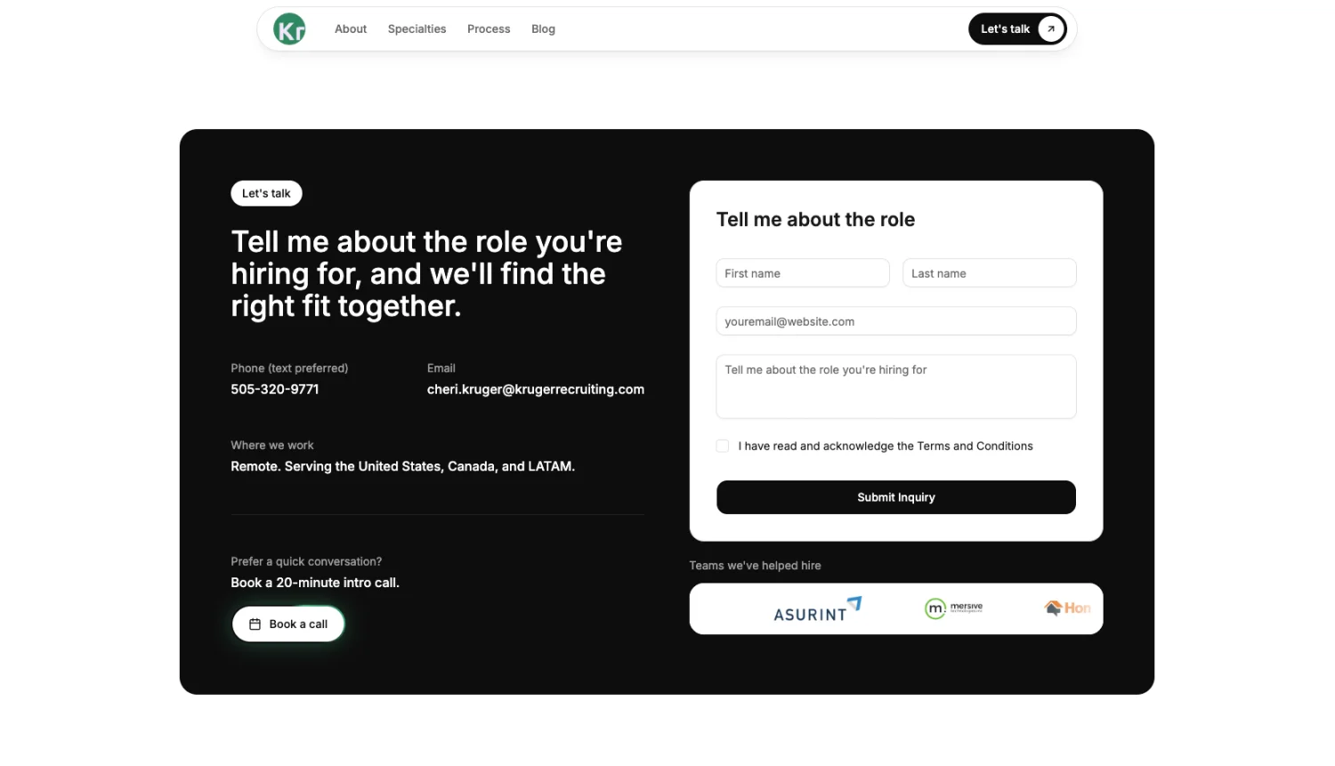
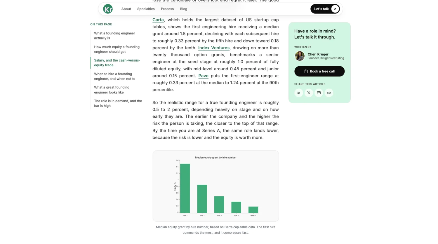
A boutique recruiter lives and dies on credibility, so the build leans into it. There is a real blog with substantive, well-researched pieces, like a breakdown of what fair equity looks like for an early founding engineer, so the site shows expertise instead of just claiming it. The contact flow is deliberately low friction: a short tell me about the role form, her number with a note that text is preferred, and a one-click way to book a twenty minute call.
Under the hood
It is a fast, static-first Astro site with React where it needs interactivity, styled in Tailwind, with the contact form wired through Resend and the whole thing deployed on Cloudflare. It loads quickly, reads cleanly on a phone, and gives Cheri a brand that finally feels as personal and as sharp as she is.
Let's build something.
Have a product to ship or a project to scope? Let's talk.