Lomena Health
A premium wellness brand built from nothing: logo, interiors, and a site that feels alive.
Overview
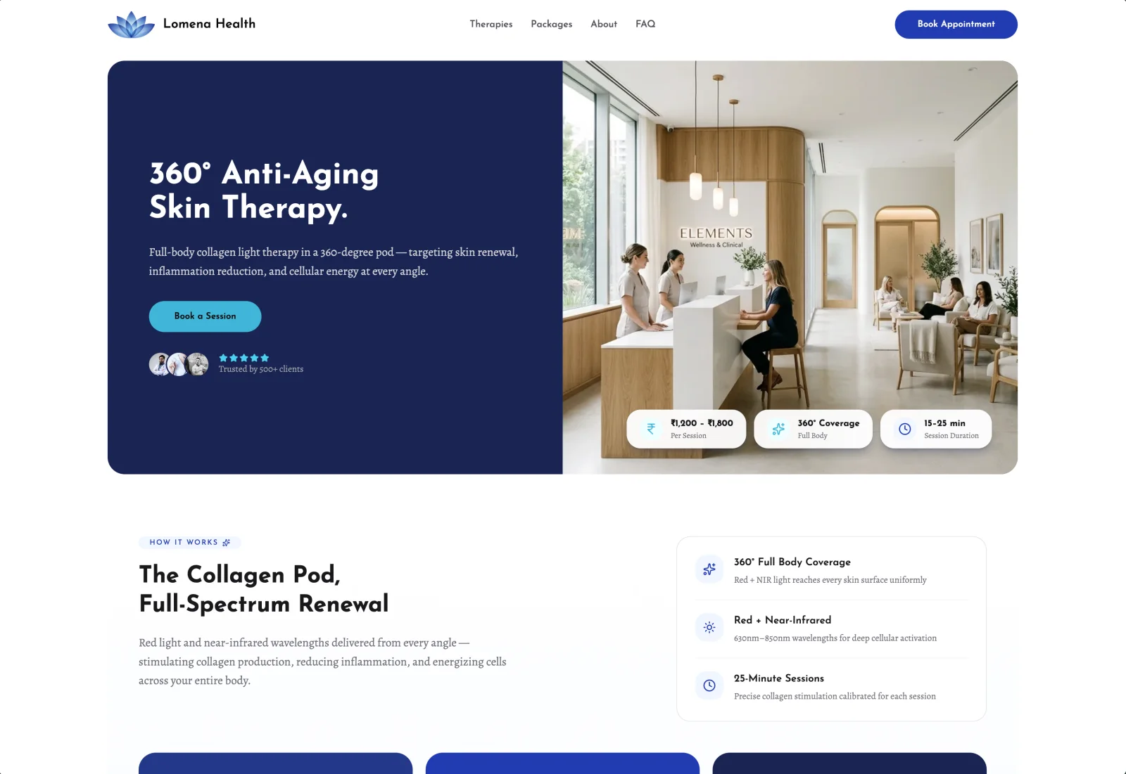
Lomena Health is a clinical wellness brand: doctor-supported, scientifically grounded therapies for metabolism and longevity. We did not redesign Lomena. We built it from nothing.
A brand from a blank page
New brand, complete creative freedom, no existing identity to honor or fight against. That freedom is a gift and a burden. It meant designing everything: the visual world of the name, the blue lotus mark with its gradient from deep ultramarine to sky blue, the type, the color, the voice, and every screen. It took roughly three times longer than a normal build, and that was the point. When you are setting the standard instead of matching one, every decision is yours to get right.
Designed entirely in Pencil AI
Every pixel was designed from scratch in Pencil AI, our design tool, before a single line of code. Logo explorations, the full design system, each page, all of it lived as design first, so we could push the premium feel as far as it would go before committing to the build.
The brand left the screen
The part I am proudest of is that the brand did not stop at the website. I worked directly with the interior designer for the physical clinic, translating the digital identity into the space: the light, the materials, the finishes, the small details, so a patient walking into a Lomena suite feels the same calm, clinical premium they felt on the site. Very few web projects get to shape the room they are advertising. This one did.
An interface that feels alive
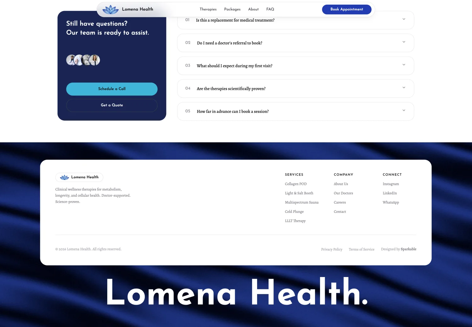
Premium is not only how something looks, it is how it moves. The whole site carries a quiet, considered motion language, and the animated footer is my favorite piece of it: the Lomena wordmark resting on a slow, flowing field of deep blue silk, rendered in real time. It is the last thing you see, and it lingers.
Built for what is coming
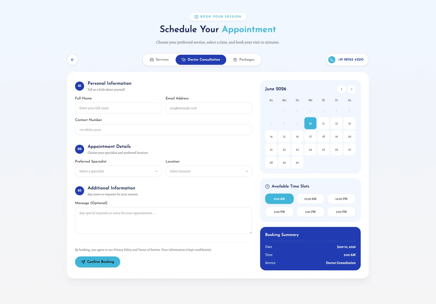
Lomena is an ongoing engagement, and the site is only the first chapter. Next is a full patient application, and a layer of automation the client wants woven through the experience: real-time doctor availability, self-serve booking, and the operational glue that lets a boutique clinic run like a much larger one. The brand and the system were designed from day one to grow into all of it.
Let's build something.
Have a product to ship or a project to scope? Let's talk.